Informatics Practices > data-handling-and-visualization > Data Visualization Using Pyplot
(a) Akriti keeps the calorie count of different food items as follows: Food=['Apple', 'Banana', 'Rice', 'Wheat', 'Carrot'] Calorie=[72,105,204,455,52] Write a Python code to generate a Bar Chart on the given data, having suitable Chart Title and labels for X and Y axis. Also add suitable statement to save this chart with the name calorie.png.
OR
(b) Consider the following data: Year | Student Strength 2019 | 150
2020 | 180
2021 | 240
2022 | 120
2023 | 180
Write a Python code to draw the line chart having title "Year Wise Students Strength in Class XII", X-axis label "Year", Y-axis label "Student Strength", and points appropriately plotted.
Line Chart
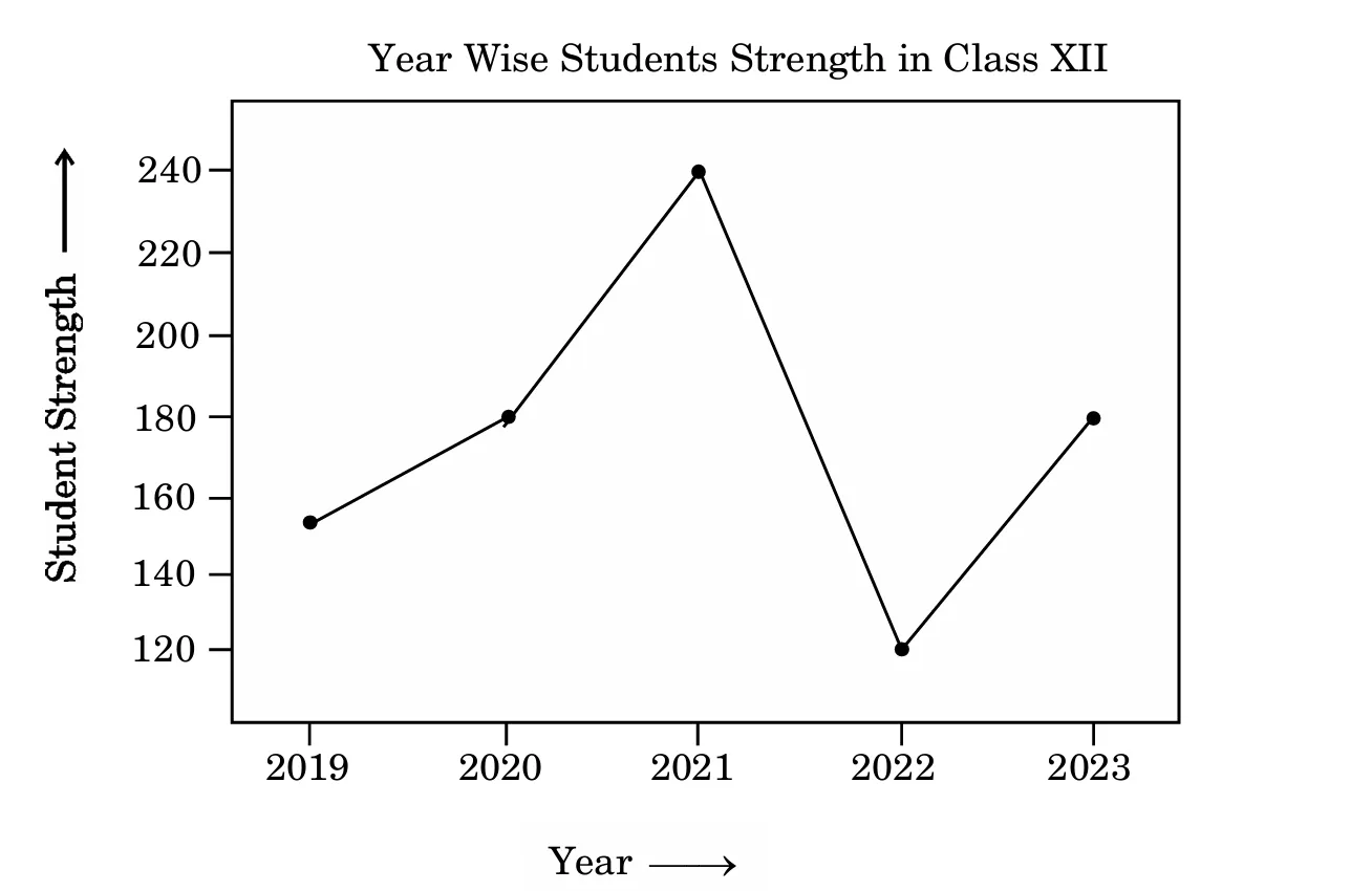
Also give suitable Python statement to save this chart with name, stud.png.
Current Session
Community Stats
Track Your Progress
Sign up to save your practice progress and get personalized insights across all topics.